The Architect’s Palette: Strategic Color Mixing for the Serious Watercolorist

In the initial stages of watercolor practice, many artists rely on "convenience greens" or "pre-mixed blacks." However, as one advances, the limitations of these tube-mixed colors become apparent. They often lack the luminosity, transparency, and internal contrast required for truly professional work.
Mastery over your palette requires a shift from thinking about "color" to thinking about pigment characteristics: transparency, granulation, and staining power. By strategically combining specific pigments, you can create a sense of light and atmosphere that feels lived-in rather than manufactured.
1. The Essential Neutral: Ultramarine Blue + Burnt Sienna
This is widely considered the most versatile "workhorse" combination in a professional artist’s arsenal. Because blue and orange sit opposite each other on the color wheel, they neutralize each other to create sophisticated grays.
-
The Technical Advantage: Ultramarine Blue is a granulating pigment (the heavy particles settle into the valleys of the paper), while Burnt Sienna is generally more transparent and smooth.
-
The Result: When mixed, these two pigments create a "living" gray. Instead of the flat, dead appearance of Ivory Black, this mix allows the individual pigments to separate slightly on the page, adding subtle texture and depth.
-
Practical Application: Use a blue-heavy mix for the cool, shadowed areas of a winter scene, and shift toward a sienna-heavy mix for the deep, earthy tones of distant hills. This combination is also excellent for creating realistic rock textures
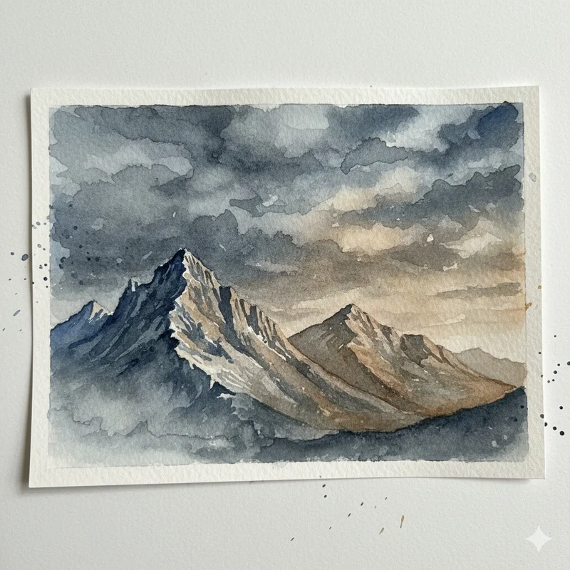
Notice how the mix of Ultramarine Blue and Burnt Sienna creates atmospheric skies and realistic mountain shadows, far more dynamic than a simple black or grey.
2. The Botanical Harmony: Lemon Yellow + Winsor (Phthalo) Blue
Mixing greens is often the greatest challenge for landscape artists. Premixed greens like Sap Green can often look artificial or "plastic." Creating your own botanical greens provides much-needed variety.
-
The Technical Advantage: Lemon Yellow (a cool, transparent yellow) mixed with a cool blue like Phthalo creates a range of vibrant, acidic greens.
-
The Modification: To make these greens look "natural," you must break the vibrancy. Adding a tiny touch of Alizarin Crimson (a cool red) will "neutralize" the green, pushing it toward the olive tones found in late-summer foliage or deep forest shades.
-
Practical Application: Use the pure mix for sunlight hitting new leaves or vibrant spring growth. The neutralized (red-added) version is perfect for the deep, shadowed interior of a forest canopy or muted distant trees.
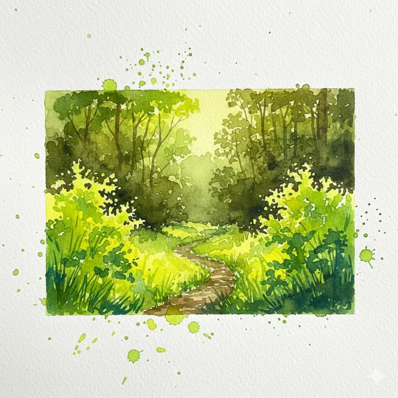
Observe the range of greens, from bright yellow-greens in the foreground foliage (Lemon Yellow + Phthalo Blue) to deeper, more neutralized greens in the distant trees (with a touch of Alizarin Crimson added).
3. Capturing Atmospheric Haze: Cerulean Blue + Light Red (or Venetian Red)
In landscape painting, Aerial Perspective dictates that objects further away become cooler, lighter, and more opaque due to the atmosphere between the viewer and the subject.
-
The Technical Advantage: Cerulean Blue is semi-opaque and slightly granulating. Light Red is an earthy, opaque iron oxide. Mixing these creates a dusty, soft lavender-gray.
-
The Result: Because both pigments have a degree of opacity, they naturally mimic the way dust and moisture in the air obscure distant objects. The mixture creates a soft, muted tone that recedes visually.
-
Practical Application: This is the perfect combination for painting distant mountain ranges, hazy horizons, or the gentle, faded colors of old stone structures. It creates a "receding" effect that pulls the viewer's eye into the depth of the painting.
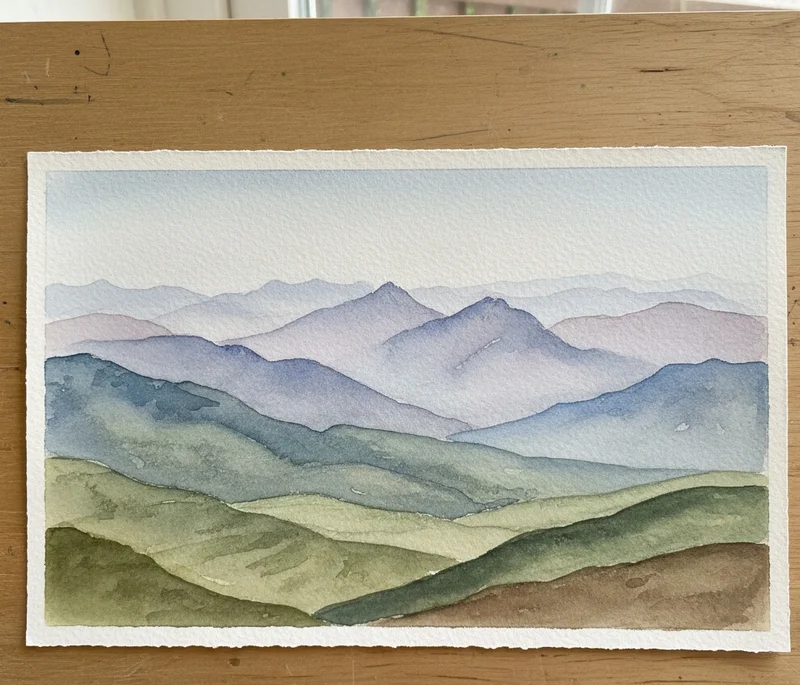
The layers of distant mountains beautifully illustrate atmospheric perspective. Notice the soft, muted blues and purples in the farthest layers, achieved by subtly mixing Cerulean Blue with a touch of a warm red like Light Red to create that hazy, receding effect.
4. The Glowing Dark: Alizarin Crimson + Viridian Green
Many artists struggle to achieve deep, dark values without losing the "glow" of the watercolor. If you use black paint to darken a color, you often make it muddy and opaque, losing the characteristic luminosity of the medium.
-
The Technical Advantage: Both Alizarin Crimson (a cool red) and Viridian Green (a cool green) are highly transparent pigments. When mixed, being complementary, they neutralize to a rich, deep near-black.
-
The Result: Because they are transparent, light travels through the layered pigment, reflects off the white paper beneath, and passes back through the paint. This creates a "glowing dark" that is incredibly deep but still possesses a jewel-like clarity, unlike the flatness of a tube black.
-
Practical Application: Use this combination for the darkest "accents" in a painting—the pupil of an eye, the deepest shadow in a velvet fabric, the intense darkness under a bridge at twilight, or the very darkest values in a portrait.
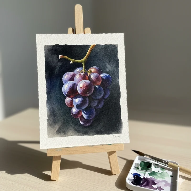
The background of these grapes demonstrates a rich, dark value achieved without true black. The deep, luminous tone is a result of layering and mixing complementary transparent colors like Alizarin Crimson and Viridian Green.
A Pro Tip for the Studio
Before applying these to a finished piece, create a Gradient Wash Strip for each pair. Start with pure Pigment A on the left and gradually transition to pure Pigment B on the right. This "mixing bridge" will show you the exact point of neutralization where the most beautiful and useful colors reside.
By thoughtfully employing these strategic combinations, you will elevate your watercolor paintings from mere colored renderings to pieces imbued with depth, light, and a sophisticated understanding of the medium's true potential.
Comments
Comments (0)
Sign in to leave a comment
No comments yet. Be the first to comment!